Search This Blog

Showing posts with label Melissa Foley. Show all posts

February 18, 2016

This White Kitchen Adds Warmth with Texture and Style

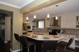
What do you do when your client wants a kitchen island but there's not enough room in the existing space? Take down walls! "We decided to take down some walls and combine two rooms into one cohesive space," says Monarch designer Melissa Foley. "We were able to marry the two spaces together successfully by using finishes."

 "The island became a real focal point in the room," explains Melissa. "We combined the warmth of the living room with the cooler colours of the kitchen space. Even the pendant lights above the island were selected in silver and gold to complement the warm and cool appearance."

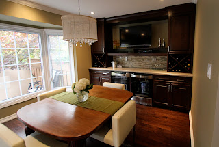
Storage solutions for this kitchen include a pull-out pantry next to the fridge; lots of deep drawers to accommodate accessible storage; and a designated communication station (see above, left) to keep charging cell phones and incoming mail out of the main kitchen work area. To create more cabinetry space in the kitchen, a second entrance to the dining room was closed off.


One-of-a-kind custom colour and finish
"The client went with a painted finish that had the texture of wood...without showing the colour of wood," explains designer Melissa Foley. "We decided on white ash. It has enough depth to the grain, allowing it to hold the paint colour while still having the texture shine through. It turned out beautifully."

February 4, 2015

Check Out This Stunning Bathroom Makeover: One Couple's Elegant Everyday Escape

As busy parents of two young children, our clients yearned for a contemporary ensuite that would meet their needs for functionality and relaxation. Inspired by an elegant hotel room ensuite they admired while vacationing in Chicago, Monarch designer Melissa Foley aimed to recreate the way they felt while in that harmonious space.

Bath Design by Melissa Foley, Monarch Kitchen & Bath Centre

To achieve this vision, a design was created that met all of their requests, including the top three items on their wish list: a larger shower, a double-sink vanity and a soaker tub.

Bath Design by Melissa Foley, Monarch Kitchen & Bath Centre


A portion of the wall between the bathroom and bedroom was removed to allow for a bigger shower. A two-sink vanity with ample drawer space was designed, providing the much-needed practical storage space that ensures a clutter-free countertop.

Bath Design by Melissa Foley, Monarch Kitchen & Bath Centre

Although the limited space available for a full-size freestanding soaker tub posed a challenge, Melissa was able to source a smaller model. This allowed the design to maintain the refined look of a luxury hotel bathroom, while still giving our clients the soothing deep soaker experience they desired.

Bath Design by Melissa Foley, Monarch Kitchen & Bath Centre


Several design details enhance both the feel and aesthetics of this stylish ensuite. The floor-to-ceiling glass shower enclosure opens the space with a simple elegance; the accent tile on the wet wall and the back of the niche provides interesting contrast, with the chrome insets creating a sparkle that catches your eye. The regal chrome fixtures add sophistication and highlight the hints of chrome in the accent tile. Both the cabinetry and countertop were kept in tones of white, with the warmth of the countertop flowing seamlessly into the tile selections. The darker floor tile ensures all elements of the design pop, and helps create a timeless look and feel for the ensuite.

Bath Design by Melissa Foley, Monarch Kitchen & Bath Centre

Bath Design by Melissa Foley, Monarch Kitchen & Bath Centre

December 3, 2014

Monarch's Design Team Gets in the Holiday Spirit by Building Holiday Homes ... with Gingerbread!

Always eager to flex their design muscles, Monarch's design team took on a holiday-themed design project on a smaller-than-usual scale -- gingerbread houses.
 
With no blueprints in sight, all they needed was some icing and colourful confections! Except for Kevin Samson -- his gingerbread house was held together with green packing tape.


November 21, 2014

Urban Effects -- Reasonably Priced Quality Cabinetry -- Made in Canada

Recently, a few members of Monarch’s design team hopped aboard an early morning flight to Winnipeg so they could spend the day with the crew at Urban Effects. Urban Effects is a division of Norcraft, now the fifth-largest kitchen and bathroom cabinet manufacturer in North America. This fall, Norcraft announced its first major expansion in 10 years: the doubling of its Winnipeg plant to more than 130,000 square feet. The expansion will be completed by mid-2015. 

First stop for designers Melissa Foley and Amanda Willson-Suppa was a tour of a new-home build. “The home was very large and the homeowners were having Urban Effects cabinetry installed throughout,” says Amanda. “From lockers in the mudroom entrance and kitchen, to all four bathrooms…even the bar! It was truly gorgeous.”

Melissa and Amanda returned to Urban Effects’ expanding manufacturing facility and showroom where they learned that the upcoming expansion will allow Urban Effects to move their shipping department on site. It will allow them to add even more of the most up-to-date manufacturing to their repertoire.

“One of the most interesting things I learned while I was there is that although we refer to one of the materials used for doors as MDF, Urban Effects only uses HDF – high-density fiber board -- for their painted cabinet doors,” says Amanda. “HDF is a superior product to MDF, allowing for stronger doors and a cleaner finish.”

Cabinetry is certainly one of the biggest expenses in a kitchen renovation. If you're looking for ways to stay within your design budget without sacrificing quality, drop by the Monarch showroom and allow one of our designers to show you the wide range of products Urban Effects has to offer.

March 1, 2013

Melissa Foley's NKBA Award-Winning "Medium Kitchen" Design

On Saturday, February 23rd, the NKBA awarded Monarch designer Melissa Foley with an honourable mention in the category of Medium Kitchen. Here are the details of what went into her winning design.


"As recent empty-nesters, our clients were ready to reclaim their living space and make it their own," says Melissa.

Located in the downtown core, their condominium already had a contemporary feel. But since they entertained frequently, they wanted a design that was a true celebration of this new phase in their lives – meeting their needs for increased traffic flow throughout their living space while updating to a more sophisticated design.


"The couple had differing opinions when it came to the overall style of the space: one wanted a more modern feel that featured off-whites, while the other was hoping for a more traditional design which would include warm wood tones," says Melissa.


"They also wanted to incorporate additional lighting and appliances into their new design. To create more living and entertaining space, a spare bedroom adjacent to the kitchen would be converted into a dining room, ensuring that its design flowed effortlessly with the rest of the living space."


Crown molding was installed throughout the condominium, and wiring was run through the crown to allow for additional appliances, electrical outlets and under-cabinet lighting.


Custom ceiling boxes were added and provide an added design element while allowing lighting fixtures to be centred in both the new kitchen and dining room spaces. 


Marital design harmony was achieved through the use of two tones: cream on the work side of the kitchen and a medium brown on the breakfast side and hutch.


 The cabinetry also represents an effective design compromise with a more modern look on the cream side blending effortlessly into more traditional cabinetry in medium brown.  To accommodate the flow of the crown molding, the breakfast nook and hutch were kept at a different installation height.


Rich granite counter tops and backsplash tie in both tones nicely, as does the new hardwood flooring installed throughout. Matching the crown molding, archway, baseboard and trim colour to the cream cabinetry allowed for all aspects of the living space to flow effortlessly.


“We created a pass-through from the kitchen to the dining room,” adds Melissa. “It’s not only functional but also adds an open, airy feel. The archway opening from the living room into the dining room provides an elegant but not-too-formal touch.”

February 25, 2013

Monarch Designer Honoured at NKBA Gala and Design Awards

Monarch Kitchen & Bath Centre president Neil Samson congratulates designer Melissa Foley on her win at the
NKBA Awards on Saturday, February 23rd, 2013

Monarch designer Melissa Foley received an honourable mention in the "Medium Kitchen" category at Saturday's NKBA Awards at the Palais Royale in Toronto.

A celebration of kitchen and bath design excellence, the evening marked the 10th gala for NKBA's Ontario Chapter. The theme for the night was "50 Shades of Grey," with attendees being asked to wear formal attire in a shade of grey.

Watch for before and after pictures of Melissa's winning design later in the week.

Congratulations Melissa!

March 1, 2012

The Sensational Simplicity of Shaker Doors: Melissa's Favourite Design Trend for 2012

Simple, functional and well-made, the Shaker door has been a kitchen design staple for decades.

Consisting of a frame overlaid on a simple panel of wood, the Shaker door design originated with the Shakers, a utopian Christian sect which settled in the Northeastern U.S. in the 18th century.

Admired for their simplicity, innovative use of dovetail joints, quality and functionality, Shaker designs continue to provide inspiration for today's furniture and interior designers.

Monarch Kitchen and Bath Centre designer Melissa Foley appreciates the versatility and timeless beauty of the Shaker door design and what it offers her clients.

"With such a wide selection of finishes to choose from, the Shaker door's elegant and durable design allows you to create both a modern and a traditional look, all with the same door style," says Melissa.

"Years from now, if you decide to change the look of your kitchen, you can re-stain the cabinets — or leave them as is — and transform your space by changing the cabinet hardware, flooring, back splash and counter top."

Shaker doors -- Kitchen design by Monarch Kitchen & Bath Centre

September 30, 2011

Visualizing Your Kitchen or Bath Design Using 20-20 Design Software

One of the biggest challenges homeowners face when renovating and designing a kitchen or bathroom is visualizing the way their new living space will look when the job is done. Although floor plans are helpful for measuring out what goes where, there's nothing quite like 3D imagery to help you get a true feel for how the room will look once the renovation has been completed.

At Monarch Kitchen and Bath Centre, we use 20-20 Design software to guide our clients through the design process, showing them their ideas as both a floor plan and with elevation views with 2D and 3D shapes.


"I've found the 20-20 Design program to be incredibly beneficial," says Monarch designer Sarah Overholt. "Not only can my clients see the layout we are proposing to them, but they can literally stand in their new space...and this is very helpful since most clients come to us because they are unable to visualize how their new space will look and feel."

This industry-leading software allows Monarch to design, plan and visualize kitchens and baths using thousands of products from manufacturer catalogs and realistic 3D renderings. Created specifically for the kitchen and bath industry, this dynamic program ensures that all designs follow the industry-standard design guidelines set out by the National Kitchen and Bath Association. In fact, when Monarch designer Melissa Foley submitted her design to the NKBA Kitchen Design Competition earlier this year, she submitted 3D renderings created with 20-20 Design software.

"With a wide range of appliances, furnishings, plumbing items, and finishes, our clients can get a true concept of their space," adds Sarah.

If the inability to visualize your new kitchen or bathroom is keeping you from making your renovation dreams a reality, Monarch's team of designers can help. Drop by our Pickering showroom or call us at 905-686-2001.


March 10, 2011

What is Melissa Foley's Favourite Design Trend for 2011?

 LED Lighting

"One of the growing trends in kitchen design today is LED lighting," says Monarch designer Melissa Foley. "LED lights are about 10 times as energy efficient as incandescent bulbs with the same light output. This means high efficiency, low energy use and less maintenance for the homeowner.

Photo courtesy of Richelieu Hardware
"LED lights also last approximately 100 times longer than incandescent bulbs and 10 times longer than a fluorescent tube.

"In the past, the downside to LED lighting was that the colour temperature was more similar to a fluorescent light, and they did not give off the warm lighting tones of an incandescent," Melissa explains. "However, as technology advances, more and more suppliers are catering to the design world and finding ways to create LEDs with a warmer colour temperature.

"At Monarch, we have installed LED lighting in many of our clients' homes and they couldn't be happier! We have a variety of lighting options available and can help you decide which works best for you and your space."

December 7, 2010

A Kitchen Design that Keeps Your Pets in Mind (Part Two)

Pepsi's Kitchen BEFORE
While it's important to keep pets safe during your kitchen renovation, you may also want to keep them in mind during the design process. After all, as the heart of the home, your kitchen should be a warm, inviting place for ALL members of your family. This includes your pets.

Pepsi's Kitchen AFTER
Take Pepsi, for example. He's a five-year-old Havanese who lives in Thornhill. Over the past two years, Pepsi has lived through two complete Monarch bathroom makeovers and a main floor redesign...including the installation of a Monarch custom kitchen.

As an important member of the family, Pepsi's needs were taken into consideration and designers Melissa Foley and Neil Samson incorporated a built-in dog bed into the kitchen cabinetry design.

Pepsi's kitchen: A stunning design that meets the needs of the ENTIRE family.


November 19, 2010

When Only a Happy Client Will Do

www.homestars.com
While an 8 out of 10 rating on Homestars.com might be enough for some kitchen and bath design companies, a recent review by "Jenni in T.O." left president Neil Samson wondering where Monarch had gone wrong. After reading her 8/10 review, Neil and designer Melissa Foley contacted Jenni immediately and resolved the outstanding issue to her complete satisfaction. Jenni re-posted her review and gave Monarch Kitchen and Bath Centre a 10/10 rating.

Posted by Jenni in T.O. on November 8, 2010
"Monarch did my bathroom renovation and there were a few outstanding issues which initially led me to give a lower rating. However, Neil and Melissa were amazing at following up to ensure that I was completely satisfied and I now am!! Thank you for superior customer service and believing in your product! I will definitely recommend Monarch to others and use them again myself!"

Another 10/10 rating posted last week:

Wow factor!
Posted by Jeff in Pickering on November 15, 2010
"We shopped around a few local kitchen places before we chose Monarch. Melissa was excellent in making us feel special and that we were making the right decision. She presented us with an excellent design that covered all of our 'must haves'. She was thorough, listened to our ideas and suggestions and both her and Neil were always accessible to answer any questions or concerns that we had. Of course as with any renovation, there are glitches, but the ones we had were very minor and handled in a professional and timely manner. We are extremely happy with the end results and have blown away our family and friends with the transformation. See the photos for yourself! We would definitely recommend Monarch Kitchen to anybody." 


For a complete list of Monarch Kitchen and Bath Centre reviews on Homestars, click here.


November 9, 2010

Monarch Designer Enters NKBA Kitchen Design Competition

Monarch designer Melissa Foley is hoping a recent kitchen design has what it takes to catch the attention of judges at the National Kitchen & Bath Association's (NKBA) annual design competition. 

Monarch is proud to be a member of the NKBA, an organization that promotes professionalism and ethical business practices and sets industry standards for conduct and construction around the world. With over 40,000 members, winners of NKBA's annual design competition represent the top kitchen and bath designers in North America.

"I decided to enter this kitchen project into the NKBA design competition because it is one of the biggest transformations of a space I have designed so far in my career," explains Melissa. "The client's typical U-shaped kitchen and closed-off dining room has been transformed into an open concept space where they feel comfortable entertaining their guests."

Creating a warm, welcoming and functional environment to entertain friends and family was a priority for Melissa's clients. The wall between their kitchen and dining room was removed, opening up the main floor so it now illuminates with natural light, creating a bright and cheerful feel.
To keep costs down, the structural post was left in and the island became the focal point of this new area. The newly acquired space allowed room for the pantries, refrigerator, microwave and a decorative open-shelf unit, and all tall units were put along one wall, opening up the rest of the room for much needed counter and workspace.
With the back wall now the cooking area, a convenient prep sink under the window and ample workspace on each side of the range, Melissa's happy clients can now easily work side-by-side. A small desk area at the very end of the range wall keeps papers within reach but out of the way. The old dining room—now part of the open-concept kitchen—with double beverage fridges, a wall-mounted TV and wine racks became the ultimate entertainment space and serves as the main eating area, as well.
"The traditional look of the cabinetry, the modern look of the hood fan, tile, faucets and stools, the elegance of the lighting fixtures and the vintage feel of the recycled wood table has transformed this into a unique, inviting dream entertainment space," says Melissa.

Click here to view NKBA's 2010 winning designs.