Search This Blog

Showing posts with label NKBA. Show all posts

October 2, 2014

Ready to Renovate? Monarch Celebrates Kitchen and Bath Month with a Giveaway!

The National Kitchen and Bath Association (NKBA) has declared October as Kitchen and Bath Month, and Monarch Kitchen & Bath Centre's design team is ready to celebrate with you. If you're planning a new kitchen or bath design, Monarch has the incentive you need to kick your renovation plans into full gear!


Celebrate with Monarch!
Book a kitchen or bath design project with Monarch Kitchen and Bath Centre before October 31st, 2014, and receive a free faucet or sink (up to a maximum value of $500).

How to Qualify:
  1. Any kitchen or bathroom renovation project contracted with Monarch Kitchen and Bath Centre is eligible to receive a free faucet or sink, to a maximum value of $500.
  2. The giveaway is available from October 1st to October 31st, 2014.
  3. Only one giveaway per project.
  4. Your Monarch Kitchen and Bath Centre contract and deposit must be signed and collected prior to October 31st, 2014.
  5. By participating in this giveaway, you are giving Monarch Kitchen and Bath Centre, or its representatives, the right to use your image, drawings, and project images for use in advertising.
Monarch Kitchen and Bath Centre is committed to your complete satisfaction. Drop by our showroom today and let us know how we can make your renovation dreams a reality!

August 16, 2013

The Beauty and Versatility of Viatera Quartz Countertops

Earlier this year, over 300 National Kitchen and Bath Association (NKBA) members-designers from the United States and Canada responded to NKBA’s annual design trends survey. In the survey, respondents were asked to report the materials, product types, and design styles they specified over the final three months of 2012. The results are in and it appears that quartz countertops are making a comeback: “While the use of quartz finishes was in slight decline last year, it has surfaced as a clear trendsetter this year [2013].” ~ NKBA

If you’re considering a kitchen or bath renovation this fall, chances are choosing a new countertop is on you’re to-do list.

Monarch Kitchen and Bath Centre designers often recommend quartz countertops to our clients. Stunning and exceptionally versatile, quartz is low-maintenance, resistant to stains and comes in a variety of textures, tones and colours.

The Viatera line of quartz countertops from LG Hausys, for example, is available in four colour collections. Drop by our showroom today to see them first-hand.

Terracota (warm earthen tones of beiges, browns and rust)


Woodlands (inspired by the colours and tones of the forest)


Urban Chic (an eclectic mix of colours that are both fresh and inviting)


International (bold coloured patterns, some with chips of glass, mirror and metal)


To view the Viatera Inspiration Gallery, click here.

March 1, 2013

Melissa Foley's NKBA Award-Winning "Medium Kitchen" Design

On Saturday, February 23rd, the NKBA awarded Monarch designer Melissa Foley with an honourable mention in the category of Medium Kitchen. Here are the details of what went into her winning design.


"As recent empty-nesters, our clients were ready to reclaim their living space and make it their own," says Melissa.

Located in the downtown core, their condominium already had a contemporary feel. But since they entertained frequently, they wanted a design that was a true celebration of this new phase in their lives – meeting their needs for increased traffic flow throughout their living space while updating to a more sophisticated design.


"The couple had differing opinions when it came to the overall style of the space: one wanted a more modern feel that featured off-whites, while the other was hoping for a more traditional design which would include warm wood tones," says Melissa.


"They also wanted to incorporate additional lighting and appliances into their new design. To create more living and entertaining space, a spare bedroom adjacent to the kitchen would be converted into a dining room, ensuring that its design flowed effortlessly with the rest of the living space."


Crown molding was installed throughout the condominium, and wiring was run through the crown to allow for additional appliances, electrical outlets and under-cabinet lighting.


Custom ceiling boxes were added and provide an added design element while allowing lighting fixtures to be centred in both the new kitchen and dining room spaces. 


Marital design harmony was achieved through the use of two tones: cream on the work side of the kitchen and a medium brown on the breakfast side and hutch.


 The cabinetry also represents an effective design compromise with a more modern look on the cream side blending effortlessly into more traditional cabinetry in medium brown.  To accommodate the flow of the crown molding, the breakfast nook and hutch were kept at a different installation height.


Rich granite counter tops and backsplash tie in both tones nicely, as does the new hardwood flooring installed throughout. Matching the crown molding, archway, baseboard and trim colour to the cream cabinetry allowed for all aspects of the living space to flow effortlessly.


“We created a pass-through from the kitchen to the dining room,” adds Melissa. “It’s not only functional but also adds an open, airy feel. The archway opening from the living room into the dining room provides an elegant but not-too-formal touch.”

February 25, 2013

Monarch Designer Honoured at NKBA Gala and Design Awards

Monarch Kitchen & Bath Centre president Neil Samson congratulates designer Melissa Foley on her win at the
NKBA Awards on Saturday, February 23rd, 2013

Monarch designer Melissa Foley received an honourable mention in the "Medium Kitchen" category at Saturday's NKBA Awards at the Palais Royale in Toronto.

A celebration of kitchen and bath design excellence, the evening marked the 10th gala for NKBA's Ontario Chapter. The theme for the night was "50 Shades of Grey," with attendees being asked to wear formal attire in a shade of grey.

Watch for before and after pictures of Melissa's winning design later in the week.

Congratulations Melissa!

November 6, 2012

NKBA Members Weigh In on The Top 10 Kitchen and Bath Design Trends for 2012

In the next few weeks, Monarch designers will be discussing their favourite kitchen and bath design trends for 2013. Before we look forward, let's take a look back at what materials and products NKBA professionals were using during the final months of 2011.

In NKBA’s Winter 2012 newsletter, writer Timothy Captain summarizes the results of the 2012 NKBA Design Trends Survey. Over 350 NKBA member designers participated in the survey, citing the materials, product types, and styles they incorporated into their kitchen and bath designs over the last three months of 2011.

“Their responses provide insight into design trends that will take hold in the kitchen and bath market in 2012,” writes Captain.

Here are some highlights from NKBA’s Kitchen and Bath Style Report:


KITCHENS
Cherry Wood in Decline
  • Although 80% of NKBA member kitchen designers had recently specified cherry cabinetry as 2010 approached, that figure dropped to 72% last year and fell again to 69% heading into 2012.
  • No one other wood species is taking that market share on its own, as even maple dropped in popularity this year, falling from 77% last year to 70% now.
  • Lesser-used woods are now being specified more often include oak, (22%); walnut (13%); birch (15%); and bamboo (10%). While alder is currently specified by 27% of kitchen designers, that figure is down from 30% last year and from 40% two years ago.
Darker Finishes
  • Natural kitchen cabinetry continues a steady move toward darker finishes. While light natural finishes have been recently specified by 30% of kitchen designers, medium natural finishes stand at 55%, with dark natural finishes at 58%.
  • Among painted cabinetry, white continues to be the most popular option (59%), while other colors were specified by only 38% of designers.
  • Distressed finishes are making a comeback. Up from 5% to 22% in the past year.
Glass Backsplashes
  • More than half of kitchen designers used glass as a backsplash material, rising from 41% a year ago to 52% now. This trails only natural stone tile at 60% and ceramic tile (including porcelain), which has been specified of late by some 74% of designers.
  • Ceramic tile backsplashes are on the decline, as they stood at 78% a year ago and 88% two years ago.
  • Other popular backsplash materials are granite at 30% and quartz at 20%. The popularity of these materials as backsplashes is due to their high use as countertop materials.
LED Lighting
  • LED lighting was specified by 70% of NKBA member kitchen designers, up from 50% in 2010.
  • The use of compact fluorescent lights (CFLs), which use roughly a quarter the energy of an incandescent bulb while producing the same amount of light, has dropped to 36% (from 26% in 2010). The drop is believed to be a result of the poor color of the light they produce and the presence of mercury in the bulbs.
Pull-Out Faucets
  • The use of pull-out faucets has increased from 88% to 93% in the past three years. In other words, 14 of out every 15 designers who designed a kitchen over the final three months of 2011 incorporated a pull-out faucet.
BATHROOMS
Medicine Cabinets
  • Practicality has won out and medicine cabinets are making a comeback. After being specified by 43% of NKBA member bathroom designers leading into 2010, medicine cabinets dropped to 36% last year. However, as designers entered 2012, some 66% had recently incorporated a medicine cabinet into a bathroom remodel.
KITCHENS & BATHROOMS
Transitional Over Traditional
“For the first time since the NKBA began tracking annual design trends, traditional is no longer the most popular type of design,” writes Captain. “In both the kitchen and the bathroom, transitional is now the most common style. While the traditional style has consistently been used by roughly three quarters of NKBA member designers in both the kitchen and the bath, that figure fell to 58% in kitchens and 59% in bathrooms this year.

"Contemporary is the next most common style, up 5% to 52% in kitchens and up 10% to 53% in bathrooms from a year ago. Shaker, arts and crafts, and cottage remain the next most frequently used styles.”
Solid Surfaces
  • The use of solid surfaces in the kitchen had continued to rise, up from 11% in 2010 to 30% of designers for use in kitchens.
  • Granite (91% for kitchens; 71% for bathrooms) and quartz (69% for kitchens; 53% for bathrooms) continue to be the top two choices/
  • Marble is currently the third most popular vanity top material at 41%, up 3% from a year ago. The use of glass vanity tops has more than doubled over the past two years, from 5% heading into 2010 to 11% today.
Shades of Gray
  • Designers chose gray as the color scheme of choice in 33% of their kitchen redesigns and 40% of their bathroom remodels.
  • Whites and off-whites continue to be the most popular color schemes for both the kitchen and bathroom, followed by beiges and bones. Brown is the third most popular color in kitchens and the fourth most popular in bathrooms, just behind gray.
  • In the kitchen, bronzes/terracottas have risen over the past two years from 20% to 25% to 31%, while greens have increased from 18% two years ago to 32% today.
Polished Chrome is Back
  • In the kitchen, polished chrome has recently been specified by 52% of NKBA member designers, while in the bathroom, its use has increased from 46% to 65% over the past year. At the same time, polished nickel is up from 17% to 25% in kitchens and from 28% to 32% in bathrooms.
  • The use of stainless steel rose slightly from 46% to 50% in the kitchen and increased significantly from 16% to 28% in the bathroom. Bronze finishes, although popular, dipped a bit from a year ago, falling from 49% to 41% in kitchens, while their use remained flat at 41% in bathrooms.
To read the entire 2012 Kitchen & Bath Style Report, click here.

April 20, 2012

NKBA's 2011 Best Kitchen Design Winner Used Nature as Her Muse

Next week, the National Kitchen and Bath Association (NKBA) will announce the winners of the 2012 NKBA design competition at the Kitchen and Bath Industry Show (KBIS) in Chicago.

We thought it would be fun to look back at last year's award-winning design for Best Kitchen by Chris Novak Berry of St. Louis, Michigan. In this video, Chris explains how she used the home's surrounding woods and nature as her primary design inspiration.


Are you considering a kitchen renovation? Your kitchen doesn't have to be as spacious as the one in this video to include the elements and features you love.

Drop by Monarch Kitchen & Bath Centre today and chat with one of our designers about what inspires you. We'd love to help you make your kitchen design dreams a reality.

April 2, 2012

Walk-in Showers: Sarah's Favourite 2012 Bath Design Trend

Sleek and elegant, the walk-in shower is designer Sarah Overholt’s favourite bath design trend.

Often home to an elaborate, spa-like shower system, today’s walk-in showers can give an airy open feel to a large bathroom or keep a small bathroom from looking cramped.

“The walk-in shower is becoming a very important design feature in bathrooms where homeowners are searching for a 'spa-like' feel," says Sarah. "Where all aspects of the bathroom are open and flowing."

Walk-in shower -- Bath design by Monarch Kitchen & Bath Centre
“There are many reasons why homeowners choose walk-in showers when redesigning their bathroom. For example, when you are looking to have open access to your shower, you can create a shower designs to incorporate many modern conveniences and contemporary looks suitable for a variety of bathroom décor,” explains Sarah. “And because walk-in showers are generally larger, you can also have a dry zone near your walk-out area. This is a great spot for adding teak benches and towel hooks.”

In this video, the designer of the 2011 NKBA Best Bathroom showcases an extravagant example of how seamlessly walk-in showers can be incorporated into a bathroom.

December 31, 2010

Looking Back: Top Kitchen and Bath Trends for 2010

Starting next month, Monarch Kitchen and Bath Centre designers will weigh in on their favourite new kitchen and bath design trends for 2011.

Before we move forward, let's go back to last May when the National Kitchen & Bath Association (NKBA) announced the top 10 Kitchen and Bath Design Trends based on winning entries in the 2010 NKBA Design Competition. They were:

1. Concealed Kitchens
"The incorporation of integrated and concealed appliances allows the kitchen to enhance rather than intrude into other spaces. Clean structural lines coupled with sleek color palettes enable the space to establish a distinctive identity, without overpowering the surrounding rooms."

2. Beverage Stations

This includes undercounter refrigerators and wine refrigeration, coffee/cappuccino makers, and the storage of stemware, coffee cups and silverware.

3. Scaling of Elements
 "An irregularly textured pebbled wall, marbled surface in glass tile, reflective metallic material, or symmetrically hung pendant lighting directs the eye around the room and contributes to a balanced space. Distinctive wall coverings, tin ceilings and the implied texture of a pronounced wood grain are all stand-out details that are being seen as contributors to the balanced scale of current designs." 
 
4. Color with Energy
Vibrant colours such as rich blues, purples, greens, and citric yellow were popular choices for kitchen and bath designs in 2010. "Colors exuding emotion, acting not merely as a passive backdrop for the room, but bringing life through lighting, wall colors, and wood tones, are profoundly impacting the most innovative designs." 
 
5. Soft Geometry
Rounded shapes for the edge of a counter or island top or on an arch over an entryway or cooking hearth allows for a "smooth-flowing traffic pattern throughout the room, while an appropriately placed arch will bring an overall softening to the more angular fixed features that are typical in kitchens and baths."

6. Space Subtleties 
"Floating vanities and wall-mounted toilets allow an unobstructed and spacious feel to a bathroom, while appliances that are stacked and positioned within islands are contributing to functionality in the kitchen by bringing together task space with the right appliances." 
 
7. Design Framing
"A seemingly simple detail, such as the use of a soffit along the ceiling or a width of wall space surrounding inset cabinetry, can call out the item being framed as a focal point while also providing visual balance to the room."

8. Varying Heights
"Pairing lower desk and prep areas with higher breakfast bar surfaces provides convenient task-specific spaces, which fosters a greater level of family interaction within the kitchen. In the bathroom, this design concept not only provides function, but balances the space."

9. Japanese Influences
"The impact of Japanese design can be seen very subtly in clean lines, open spaces, and neutral color palettes with bold splashes of color in select areas...Artwork, Japanese antiques, and the traditional qualities of Japanese culture are at the core of some compelling kitchen and bath designs."

10. Art Integration
Homeowners found a way to keep their kitchen and bath designs personal in 2010 by including a favourite piece of art or an antique sculpture in the overall theme of the room. "This method of integration allows the designer to fold all other aspects of the room around the treasured piece."

For the complete NKBA article, click here

November 9, 2010

Monarch Designer Enters NKBA Kitchen Design Competition

Monarch designer Melissa Foley is hoping a recent kitchen design has what it takes to catch the attention of judges at the National Kitchen & Bath Association's (NKBA) annual design competition. 

Monarch is proud to be a member of the NKBA, an organization that promotes professionalism and ethical business practices and sets industry standards for conduct and construction around the world. With over 40,000 members, winners of NKBA's annual design competition represent the top kitchen and bath designers in North America.

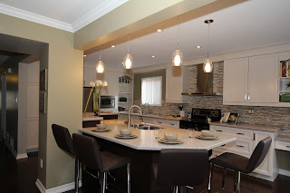
"I decided to enter this kitchen project into the NKBA design competition because it is one of the biggest transformations of a space I have designed so far in my career," explains Melissa. "The client's typical U-shaped kitchen and closed-off dining room has been transformed into an open concept space where they feel comfortable entertaining their guests."

Creating a warm, welcoming and functional environment to entertain friends and family was a priority for Melissa's clients. The wall between their kitchen and dining room was removed, opening up the main floor so it now illuminates with natural light, creating a bright and cheerful feel.
To keep costs down, the structural post was left in and the island became the focal point of this new area. The newly acquired space allowed room for the pantries, refrigerator, microwave and a decorative open-shelf unit, and all tall units were put along one wall, opening up the rest of the room for much needed counter and workspace.
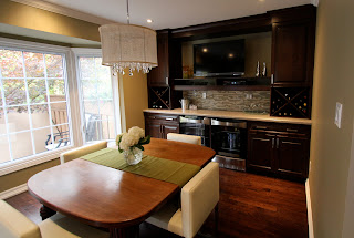
With the back wall now the cooking area, a convenient prep sink under the window and ample workspace on each side of the range, Melissa's happy clients can now easily work side-by-side. A small desk area at the very end of the range wall keeps papers within reach but out of the way. The old dining room—now part of the open-concept kitchen—with double beverage fridges, a wall-mounted TV and wine racks became the ultimate entertainment space and serves as the main eating area, as well.
"The traditional look of the cabinetry, the modern look of the hood fan, tile, faucets and stools, the elegance of the lighting fixtures and the vintage feel of the recycled wood table has transformed this into a unique, inviting dream entertainment space," says Melissa.

Click here to view NKBA's 2010 winning designs.