Search This Blog

Showing posts with label open-concept. Show all posts

February 18, 2011

What is Neil Samson's Favourite Design Trend for 2011?


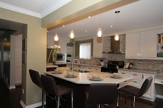
A great room by Monarch Kitchen & Bath Centre
This Pickering "great room" is the new living room

A great room is a multi-purpose open-concept area that offers a warm and welcoming dimension to a home. Usually spacious and informal, it encourages interaction as family and friends are able to gather in a large, relaxed setting.
 
“While great rooms are certainly not new, it seems an increasing number of families are opting for more casual spaces in their homes,” says Neil Samson, Monarch Kitchen and Bath Centre president. “Our clients are ridding themselves of the stuffy living rooms and separate dining rooms and bringing not only the spaces together but their families, as well.”

With the emphasis on comfort and relaxation, homeowners are encouraged to furnish their great rooms with low-maintenance comfortable items in sizes that fit the scale of the room. To help the room appear less cluttered, choose neutral colours and clean lines.

“Opening up the main floor of your home can help to bring about a more casual and comfortable family atmosphere. The kitchen is no longer a space that we try to hide but the centerpiece and heartbeat of our homes,” explains Neil. “It becomes a multifunctional room where everyone can gather--to cook, do homework, work in a home office, relax or entertain.”

“So why not open up your main floor to the 'great room' kind of atmosphere?”

December 31, 2010

Looking Back: Top Kitchen and Bath Trends for 2010

Starting next month, Monarch Kitchen and Bath Centre designers will weigh in on their favourite new kitchen and bath design trends for 2011.

Before we move forward, let's go back to last May when the National Kitchen & Bath Association (NKBA) announced the top 10 Kitchen and Bath Design Trends based on winning entries in the 2010 NKBA Design Competition. They were:

1. Concealed Kitchens
"The incorporation of integrated and concealed appliances allows the kitchen to enhance rather than intrude into other spaces. Clean structural lines coupled with sleek color palettes enable the space to establish a distinctive identity, without overpowering the surrounding rooms."

2. Beverage Stations

This includes undercounter refrigerators and wine refrigeration, coffee/cappuccino makers, and the storage of stemware, coffee cups and silverware.

3. Scaling of Elements
 "An irregularly textured pebbled wall, marbled surface in glass tile, reflective metallic material, or symmetrically hung pendant lighting directs the eye around the room and contributes to a balanced space. Distinctive wall coverings, tin ceilings and the implied texture of a pronounced wood grain are all stand-out details that are being seen as contributors to the balanced scale of current designs." 
 
4. Color with Energy
Vibrant colours such as rich blues, purples, greens, and citric yellow were popular choices for kitchen and bath designs in 2010. "Colors exuding emotion, acting not merely as a passive backdrop for the room, but bringing life through lighting, wall colors, and wood tones, are profoundly impacting the most innovative designs." 
 
5. Soft Geometry
Rounded shapes for the edge of a counter or island top or on an arch over an entryway or cooking hearth allows for a "smooth-flowing traffic pattern throughout the room, while an appropriately placed arch will bring an overall softening to the more angular fixed features that are typical in kitchens and baths."

6. Space Subtleties 
"Floating vanities and wall-mounted toilets allow an unobstructed and spacious feel to a bathroom, while appliances that are stacked and positioned within islands are contributing to functionality in the kitchen by bringing together task space with the right appliances." 
 
7. Design Framing
"A seemingly simple detail, such as the use of a soffit along the ceiling or a width of wall space surrounding inset cabinetry, can call out the item being framed as a focal point while also providing visual balance to the room."

8. Varying Heights
"Pairing lower desk and prep areas with higher breakfast bar surfaces provides convenient task-specific spaces, which fosters a greater level of family interaction within the kitchen. In the bathroom, this design concept not only provides function, but balances the space."

9. Japanese Influences
"The impact of Japanese design can be seen very subtly in clean lines, open spaces, and neutral color palettes with bold splashes of color in select areas...Artwork, Japanese antiques, and the traditional qualities of Japanese culture are at the core of some compelling kitchen and bath designs."

10. Art Integration
Homeowners found a way to keep their kitchen and bath designs personal in 2010 by including a favourite piece of art or an antique sculpture in the overall theme of the room. "This method of integration allows the designer to fold all other aspects of the room around the treasured piece."

For the complete NKBA article, click here

December 27, 2010

What Will Be Your Favourite Thing in Your New Kitchen?

Trying to decide which features to include in your kitchen redesign can be incredibly overwhelming. With so many elements to consider--cabinetry, countertops, flooring, appliances, sinks, faucets, lighting--it's no wonder some homeowners find it difficult to stay focused. Often, the best way to explore what's right for your kitchen is to learn from the experience of others.

www.dreamkitchenrenodiary.wordpress.com
A few years ago, one of Monarch's clients decided to write a blog chronicling her family's kitchen renovation process. Over several months, she recorded the reasons for the renovation, the before pictures, details and pictures of the tear down and wrote an ongoing description of how her family of four coped during that time of upheaval. One of our favourite posts--and one we're sure you'll find very useful--was written almost two years to this to day and, with her permission, we've reprinted it here:

These are a few of my favourite things
December 28, 2008

Raindrops on roses and whiskers on kittens
Bright copper kettles and warm woolen mittens
Brown paper packages tied up with strings
These are a few of my favorite things!!

We’ve been singing this song ever since we saw The Sound of Music in November. (It was wonderful, by the way.) And I can’t think of a better way to describe my kitchen than to say that it is chock FULL of my favourite things. We have hosted three dinner parties since the majority of the renovations were completed two weeks ago and I must say that people have been blown away by how incredible our kitchen has turned out. The dust and  disaster of the renovations now seems like a bad dream and in the spirit of the “12 Days of Christmas,” I’m ready to share my 12 favourite things about our new kitchen.

12. A place for everything and everything in its place – There is a ton of storage space in this kitchen and so many opportunities to store things in logical places.

11. Hidden Spice Drawers – I love the two sliding spice drawers underneath my gas cooktop. No more rifling through my cupboards; everything is at my fingertips.

10. More Countertop Space – With the addition of the island, I have a ton of countertop space. This means I can now store my mixer, espresso machine and toaster on the countertop and it doesn’t interfere with my food prep area — the island.

9. Lowered Workspace – Speaking of the island, not only is it HUGE but we had the counterop made lower than usual to accommodate our height deficiencies (translation: we’re short!). Friends, family and even Nick (in the early stages) questioned our decision to do this, but this is definitely one of our favourite features of the entire kitchen.

8. Lowered Cooktop – We also had our cooktop lowered and this makes preparing food so much easier. Instead of grabbing a stool for the final stages of my wok cooking (stop laughing, it’s not easy being short), I can actually stir big pots full of pasta or soup with ease.

7. Gas Stove – Oh, how I love my gas stove! Of course, the fact that I spent the past eight years cooking on a 30-year old almond-coloured stove may contribute to this love…but only slightly. Instant heat is a beautiful thing.

6. Breakfast Bar – This is a family favourite to be sure and a great place for guests to congregate while we mix drinks or prepare dinner. Love, love, LOVE it!

5. Lights – We have gone from three lights (in total) in our kitchen and dining room to over 20 pot lights, four pendant lights, under-cabinet lighting and a chandelier-type light fixture over our table. Needless to say, we see things a little differently now :)

4. Two Sinks – While Nick may have briefly questioned the lowered countertop on the island, I questioned whether I REALLY needed a prep sink on the island. Thank goodness I decided to keep it; I love having a sink specifically for washing fruits and vegetables…right by my food prep area. And the main sink is huge. I can stack a pile of dishes in there and it doesn’t even look full! Having two sinks is an indulgence, but hey…go big or go home!

3. Back Splash - I wanted tumbled marble, but Nick had something else in mind. We took the advice of a good friend and went to Tile Zone in Ajax and found long, narrow porcelain tiles that our pal Christian installed with black grout. The result? An urban feel that makes the cabinetry pop. I love it and I love my husband for having such great taste.

2. Roll out drawers in the pantry cupboards – I had a walk-in pantry in my old kitchen, so space wasn’t really an issue…except for the fact that I could never find anything! I love being able to pull out a drawer and see exactly what I have. It’s really quite basic…but very important.

1. Room to Move, Cook, Party and Enjoy – I had to laugh at one of the electricians that came into our home. He had been there many times since the renovation began, so he had a good feel for the space. But once the cabinets and countertops were installed, he commented that “this isn’t a kitchen, it’s a banquet hall!” Yes, our kitchen is big. One might even say huge. And this is what I love about it most. We had 12 people for dinner on the Sunday before Christmas and as everyone stood around the island and sink and stove, I realized that there was still room to move! Lots and lots of it! One of the things that I hated most about my old kitchen was that, despite its size, it didn’t make sense. The layout didn’t allow for more than two of three people in the prep area at once. I’m starting to realize that our ‘dream’ kitchen isn’t just a room for us to enjoy, but instead, it’s a place we can share with our family and friends for years to come.

To view the entire blog, visit www.dreamkitchenrenodiary.wordpress.com.

November 9, 2010

Monarch Designer Enters NKBA Kitchen Design Competition

Monarch designer Melissa Foley is hoping a recent kitchen design has what it takes to catch the attention of judges at the National Kitchen & Bath Association's (NKBA) annual design competition. 

Monarch is proud to be a member of the NKBA, an organization that promotes professionalism and ethical business practices and sets industry standards for conduct and construction around the world. With over 40,000 members, winners of NKBA's annual design competition represent the top kitchen and bath designers in North America.

"I decided to enter this kitchen project into the NKBA design competition because it is one of the biggest transformations of a space I have designed so far in my career," explains Melissa. "The client's typical U-shaped kitchen and closed-off dining room has been transformed into an open concept space where they feel comfortable entertaining their guests."

Creating a warm, welcoming and functional environment to entertain friends and family was a priority for Melissa's clients. The wall between their kitchen and dining room was removed, opening up the main floor so it now illuminates with natural light, creating a bright and cheerful feel.
To keep costs down, the structural post was left in and the island became the focal point of this new area. The newly acquired space allowed room for the pantries, refrigerator, microwave and a decorative open-shelf unit, and all tall units were put along one wall, opening up the rest of the room for much needed counter and workspace.
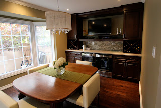
With the back wall now the cooking area, a convenient prep sink under the window and ample workspace on each side of the range, Melissa's happy clients can now easily work side-by-side. A small desk area at the very end of the range wall keeps papers within reach but out of the way. The old dining room—now part of the open-concept kitchen—with double beverage fridges, a wall-mounted TV and wine racks became the ultimate entertainment space and serves as the main eating area, as well.
"The traditional look of the cabinetry, the modern look of the hood fan, tile, faucets and stools, the elegance of the lighting fixtures and the vintage feel of the recycled wood table has transformed this into a unique, inviting dream entertainment space," says Melissa.

Click here to view NKBA's 2010 winning designs.