Search This Blog

Showing posts with label white cabinetry. Show all posts

January 12, 2017

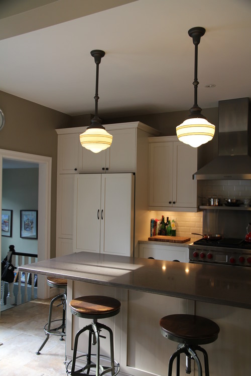
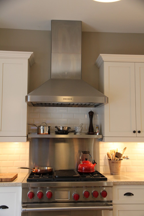
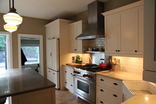
Why Young House Love DIYers Chose Custom Cabinetry and Cambria Countertops for Their White Kitchen Reno

Photo credit: Young House Love, used with permission
As kitchen and bath designers, Monarch's team is constantly monitoring trends and we draw inspiration from a variety of sources. 

Last October, when popular Young House Love DIY bloggers Sherry and John posted pictures of their latest kitchen renovation, Monarch designer Jackie Schagen was eager to see what they'd done. 

As a long-time Young House Love blog follower, Jackie wasn't surprised that Sherry and John had chosen to go with a white kitchen (their first two kitchens were also white); what she did find interesting was their departure from installing an Ikea kitchen.

For their kitchen renovation, Sherry and John chose white custom cabinetry from a local US manufacturer citing solid craftsmanship, colour consistency, and a variety of upgrade options as their reasons.

As Sherry notes in her kitchen-reveal blog post, using Ikea cabinetry "takes some ingenuity" to pull off some of the finishing touches and ensure everything looks well-balanced. 

For their kitchen counters, they went with quartz from Cambria, a name Monarch blog followers no doubt recognize. Cambria's durable, stain-resistant quartz countertops are nonporous and have been deemed as being as safe as stainless steel in commercial food preparation kitchens.
 
"Despite their love for Ikea cabinetry and saving money at every turn, in their third home renovation these seasoned DIYers decided to go with quality custom cabinetry and Cambria countertops," notes Jackie. A decision the design team at Monarch can totally get behind.

Related posts:

7 More Reasons to Love Cambria Countertops

Common-Sense Tips for Keeping Your Custom Cabinetry Beautiful

This White Kitchen Adds Warmth with Texture and Style

November 27, 2015

More on Monarch's Stunning White Kitchen Makeover

 
White kitchen design by Monarch Kitchen & Bath Centre


A few weeks ago, we posted a colourful white kitchen by Monarch designer Marion Cuddie.

Below are the before pictures, and Marion's comments on how she met her client's dream kitchen design requirements.

Before

"The homeowner delights in entertaining family and friends and found that the awkward peninsula in her old kitchen cramped movement and food prep," says Marion.

Before
The client's needs included a coffee area, drinks' storage, a sink for clean up and a sink at the prep island.

"They wanted lots of light and a bright open feeling," explains Marion. "To accomplish this, the kitchen window was enlarged to flood the space with light and expand the view to the green space beyond the property." Minimal upper cabinets also contribute to the openness. 

White kitchen design by Monarch Kitchen & Bath Centre

"With limited upper cabinet space, it became important to maximize storage in remaining cabinetry," says Marion.


White kitchen design by Monarch Kitchen & Bath Centre


(Left) Pantry items in the extra deep wall/counter cabinet are outfitted with roll-out shelves (left of the ovens and in the tall angled cabinet to the right of the fridge) to accommodate the door placement and to house overflow items and pet food.

(Right) Special attention was paid to the coffee/drinks station to keep the flow comfortable for family and guests during breakfast preparation. 

Glassware for adult entertaining is immediately available above the bar storage.

(Below) The island has become the perfect spot for Christmas cookie decorating as well as after school snacks.

White kitchen design by Monarch Kitchen & Bath Centre

October 23, 2015

Make Your White Kitchen Design POP with Colour!

This stunning kitchen design by Monarch designer Marion Cuddie is a revelation of colour and customization. Stay tuned in the coming weeks as we uncover the details of this vibrant space.

White Kitchen Design by Monarch Kitchen & Bath Centre

White Kitchen Design by Monarch Kitchen & Bath Centre

White Kitchen Design by Monarch Kitchen & Bath Centre

White Kitchen Design by Monarch Kitchen & Bath Centre

White Kitchen Design by Monarch Kitchen & Bath Centre

February 12, 2015

Monarch Designers Pick Their Favourite Kitchen & Bath Trends for 2015


White, white, slightly off-white, and more white!


“White kitchens have been back in a big way over the last few years, and 2015 is not going to be any different,” says designer Amanda Willson-Suppa. 

“White is timeless, can meet a multitude of design styles, matches existing décor impeccably, and can be so versatile. 

"Whether you are looking to re-fresh your home with new cabinets, or looking at a much larger scale renovation, white cabinetry is something everyone is comfortable with.”


Complete bathroom remodel

According to designer Kevin Samson, the popularity of bathroom remodel projects has grown to become a substantial segment of the renovation market.


 "Twenty years ago, we rarely renovated bathrooms, perhaps a tub or cabinet was updated, possibly a counter top and faucet would be swapped out," says Kevin. "Interest in complete bathroom remodels started about ten years ago and has steadily increased since.

"The majority of these projects involve stripping the room down to the studs and sub floor, and starting with a clean slate."
 

When asked about current trends and what tops the client's wish list, Kevin says heated tile floors and larger, spa-type showers lead the list. "The number one complaint? A lack of useful storage in the existing space."

More texture
Image courtesy of saranatile.com

"This year, I think we'll be seeing a lot of texture," says designer Jackie Chambers. 

"I'm enjoying playful geometric patterns in tile like herringbone and hexagons, but installed in subtle and muted colours to add depth to the space. The variance in texture in a monochromatic palette adds a level of timeless  sophistication."

May 14, 2014

White Kitchen Cabintery Provides Light, Airy Feel in this Design by Monarch Kitchen & Bath Centre

In this stunning transitional kitchen design by Marion Cuddie, white kitchen cabinetry is accentuated by exotic granite on the island and back splash. Under-cabinet lighting helps highlight the stone.
New pot lights and decorative pendants add to the natural light in this white kitchen design. Over-sized drawers provide a practical and easy-to-use storage solution. A custom table adds polish to this light and airy space.

The buffet area features matching white cabinetry and offers storage for items not used everyday. It also provides an additional serving area for hosting large family events.

This "extra special place for him" has matching white cabinetry, a TV, fridge, beer fridge and freezer drawers.

March 13, 2014

A Family Farm Home Transformed: Monarch Updates the Space and Keeps the Home’s Character Intact

“The arrival of twins this year meant our clients’ busy farmhouse required a major transformation,” explains Monarch designer Sarah Holmstrom. “Their living space needed to accommodate a home office space, an expanding household, and stay true to the overall character of the home that had been in the family for generations.”

Farmhouse Transformed: Design by Monarch Kitchen and Bath Centre
This new open concept design created five beautiful spaces that flow into each other seamlessly:
  • a large working kitchen with island to serve the day to day family needs;
  • convenient, but hidden office storage space;
  • a large welcoming dining area to entertain family and friends;
  • a central living area that adds a relaxed comfort to the space and keeps mom and the family connected;
  • the added convenience of a powder room at the back entrance.
Cleverly incorporating the required support post into a creative divider resulted in a second island that acts as a hutch for the dining room. Design by Monarch Kitchen and Bath Centre.

“By removing all of the main walls within the renovation space, we created an open area to work within,” says Sarah. “The relocation of the powder room created more area for the kitchen. The new larger kitchen area and island eliminated the need for an everyday dining table while creating added living space.”


Cleverly incorporating the required support post into a creative divider resulted in a second island that acts as a hutch for the dining room and an office space with file drawers in the kitchen. “This acts as a soft division between the work and entertaining areas of the great room,” says Sarah.


To maintain the “farmhouse feel,’ the muted white and cream tone cabinetry has a distressed look, and the main island’s wiped green textured finish provides a rustic accent. The cabinetry’s multi-levels and depths provide visual contrast, and the use of a tile that imitates weathered hardwood provides a durable, easy care floor while adding to the inviting warmth of the room.

The farmhouse feel remains thanks to muted white and cream tone cabinetry with a distressed look. The main island’s wiped green textured finish provides a rustic accent. Design by Monarch Kitchen and Bath Centre.

May 28, 2013